
Like so many other debates on the internet, we seem to be doomed to forever relitigate the question of whether “Dark Mode” color schemes are actually easier on the eyes than their “Light Mode” counterparts.
Here’s the most recent version of this argument that cropped up in my feed on Twitter:

I have an astigmatism, which I’m sure affects my opinion on this - but I can say that yes, dark mode themes are definitely much easier on my eyes compared to light-mode themes. I get intense eye-strain pretty quickly when looking at anything with a pure white background on a computer screen.
The thing that’s weird about it to me is that the argument against having a dark theme is always made with this sort of accusatory, skeptical tone: Is it really easier on the eyes? Do people really like it, or are they just being fashionable?
I’m not sure where this antagonism is borne out of, maybe it’s something that developers say because they don’t want to have to support multiple themes in the apps they work on?
What difference does it make to me if other people enjoy a different color scheme? I don’t really care if other people prefer light mode - I use dark mode because my job requires me to look at computer screens all day, and dark mode doesn’t give me headaches.
Under blackpool lights
The reason pure white backgrounds cause eye-strain is pretty simple: PC screens are backlit. There’s a big LED light behind the screen that is shining towards your eyeballs. This is the difference-maker, and it’s the reason mostly-white themes on a PC screen cause so much more eye strain than a printed book or a Kindle reader (the actual readers, not the Android tablets).

You’re staring directly into a light, and the bigger the portion of the screen that’s showing bright white, the more quickly your eyes become strained. It’s less like reading printed paper by the ambient light of a lamp or the sun, and more like trying to read a piece of paper that’s lit from beneath by a light table.
Don’t turn me into anything… unnatural
The other issue that I think compounds with the backlight of the screen, is that programmers and UI designers insist on using pure white backgrounds. I had a single “Graphic Design for the Web” class when I was in college, and the main lesson I recall the professor beating into us was to never use #FFFFFF (pure white) or #000000 (pure black) when developing websites. His reasoning was that these colors are not natural - they never appear in the real world.

You may think the pages of the book you’re reading are white text on a black background, but if you take a picture of the book, and use the Photoshop eyedropper tool on it, you will find that they’re pretty far from pure white or pure black.
Eyedropping an area of the “white” in the picture above gave me #D1C8C9, and the “black” text was #443B3C. This is the sort of “black and white” your eyes are used to perceiving in the real world - nothing is ever pure white or pure black.
So, filling the majority of the screen with a backlit, pure white background is much harsher than anything your eyes come in contact with in the natural world.
A land of contrasts
If pure black text on a pure white background is literally the highest degree of contrast a computer screen can display, why is it so often the default?
I find that dark themes tend to use a more pleasing, less maximal amount of contrast than the light counterparts. Take the default themes in Visual Studio, for instance.
The light theme uses pure black (#000000) text on a pure white (#FFFFFF) background - the highest degree of contrast possible.
Meanwhile, the dark theme is off-white (#DCDCDC) text on a dark gray (#1E1E1E) background. This lower degree of contrast, coupled with not having the entire field of the screen be blindingly bright, means that this theme is much easier on the eyes.
If developers don’t want to bother with adding a dark mode to their products, they should consider at least using a more reasonable amount of contrast in their light theme, and avoiding pure white and pure black.
Night mode is self-care
If, like me, you prefer dark mode themes with less harsh contrast, I highly recommend the Dark Reader browser plugin.
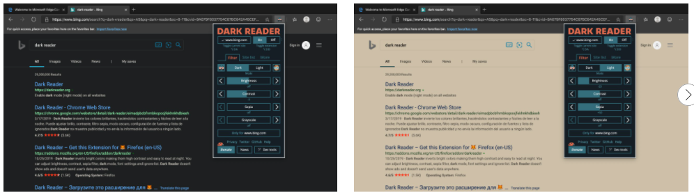
It’s free, open source, and allows you to apply a nice, lower contrast dark (or light!) theme to any website that uses the dreaded pure black text on pure white background combination.